 Liquidity LlamaMarkets · Macro · Crypto
Scripts · coming soon
Liquidity LlamaMarkets · Macro · Crypto
Macro-cycle models and order-flow tools I built and iterate on the live chart. The three macro indicators below form the backbone of the monthly regime score. Every script listed here is written and running. They are being released on TradingView as invite-only, and access opens from this page as each one goes live.
Every indicator and strategy behind the dashboards on this site. All are published to TradingView as protected, invite-only scripts — access is granted per username and the source stays closed. Links go live as each one is uploaded.
The fourteen macro checkpoints as one score on the chart.
Housing permits as an early turn signal.
Breadth, credit and vol rolled into one health reading.
Where the cycle sits, and when it historically paid to buy.
The cycle thermometer as a single sub-chart reading.
Eight exchanges, five timeframes, Traditional and Woodie, each venue on its own session.
Matched body tops and bottoms within six ticks, daily, weekly and monthly.
How often your printed levels actually get touched.
The pivotal-point break, with the sit-tight trail.
The same rules as a backtestable strategy.
All fourteen patterns, marked and filtered as on the scanner.
How one-sided the flow is — the adverse selection being priced.
The slope of the market maker's pricing rule. Its inverse is depth.
Reverting, trending or noise — signed by the variance ratio.
When the crowd is all-in and the trade has stopped paying.
Where the holder base sits against its cost basis.
The five above, composited.
The composite as a backtestable strategy.
Pair spreads with a half-life and an exit that isn't a stop.
Half-Kelly sizing against the live edge estimate.
Where the edge stops covering the cost of trading it.
Monthly trend gate, on-balance-volume confirmation, 20-day Keltner entry.
The same rules, backtestable.
Position sizer, failed-breakout detector, equity-curve governor.
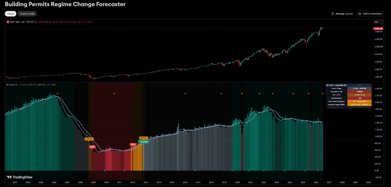
Building permits are the earliest housing signal — a decision to build, made before any activity hits the hard data. This model tracks the permit cycle against its long-run trend and shades the market backdrop WARNING → CRISIS → RECOVERY. Historically the regimes line up with the recessions that were led by housing (2007–09 especially). An ARDL long-run signal turns the read into a single call.
Readout from the July run — the current set lives in the August regime report.
Coming soon · invite-only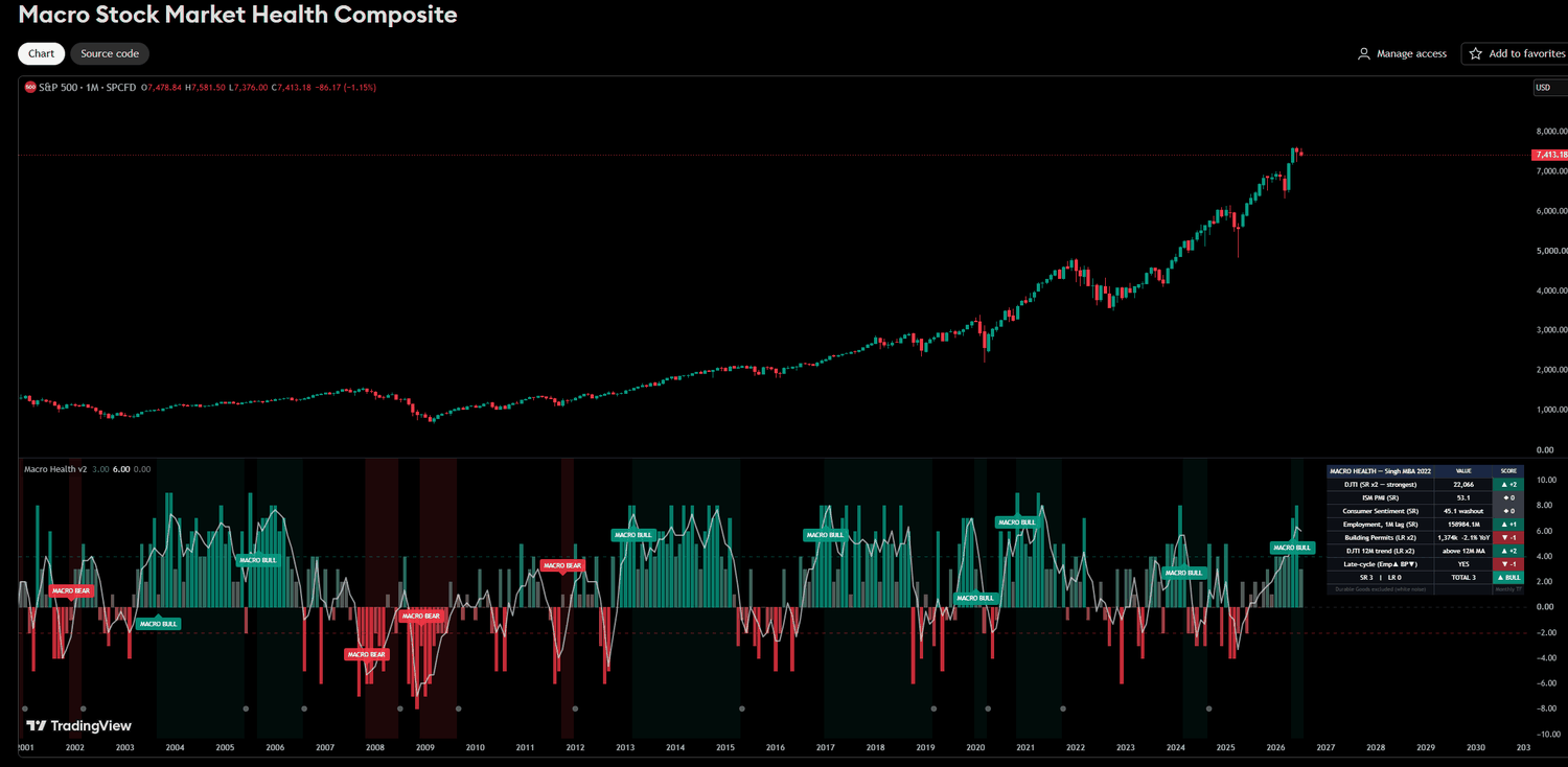
Eight macro inputs — Dow Transports, ISM PMI, consumer sentiment, employment, building permits, the Dow’s 12-month trend and a late-cycle divergence check — each scored short-run and long-run, then summed into one MACRO BULL / BEAR read. It’s the workhorse behind the composite regime score on the front page.
Readout from the July run — the current set lives in the August regime report.
Coming soon · invite-only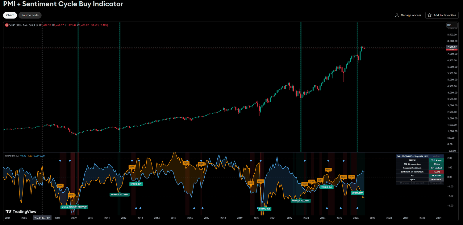
Overlays ISM PMI, consumer sentiment and the VIX to time cycle entries — flagging STRONG BUY washouts (fear + a turning PMI) and BEAR exhaustion. Historically the washout-recovery signals cluster near major lows (2009, 2020). Current read is neutral: PMI expanding but sentiment momentum still negative.
Readout from the July run — the current set lives in the August regime report.
Coming soon · invite-only
Bitcoin doesn’t trade on one exchange, and it doesn’t roll its day over at one time. Bybit and Binance close the daily candle at 00:00 UTC. OKX runs on Asia time. Coinbase runs on US time. Kraken sits an hour off UTC.
So there isn’t one daily pivot for BTC. There are eight — sitting at slightly different prices, each watched by the traders on that venue. This plots all of them at once: eight exchanges, five timeframes (daily through yearly), each anchored to its venue’s own session timezone rather than a generic UTC approximation.
It also runs two pivot calculations simultaneously — Traditional (H+L+C)/3 and Woodie (H+L+2C)/4, which weights the close more heavily. Labels carry a T or W suffix so you always know which is which. When the two methods land close together, the level is stronger than when they disagree.
Every level starts in its exchange colour and flips to white dotted the moment price trades through it. That one feature does most of the work: coloured levels above price are upside magnets that haven’t been visited, coloured levels below are downside magnets, and the white ones are spent — still useful as flipped support and resistance, but no longer a draw.
On that 86%. It is a hit rate, not a win rate — it says roughly 86 in 100 levels get touched within a day of appearing, which makes them reliable magnets. It says nothing about whether trading the touch makes money. That is the distinction that matters, and conflating the two is how people lose money with levels indicators. Use them as confluence for a directional idea, not as a signal on their own.
Two engineering notes worth stating: levels are calculated from each period’s completed data and do not repaint, and the script runs at Pine’s hard ceiling of 40 external data requests. Nothing further can be added that needs another symbol — eight venues across five timeframes with two methods is exactly what fits.
View on TradingView → · See the bot that trades it → · The level study →
Most level tools draw wicks. Wicks are where price went and was rejected. This draws bodies — where price actually opened and closed, which is where the market settled rather than where it probed.
When two candles have their body tops at the same price, or their body bottoms at the same price, that is the market arriving at the same conclusion twice, independently. The script finds those matches within a six-tick tolerance and connects them with a line extending right: ▲ for a matched body top, ▼ for a matched body bottom.
Alongside them it projects the ◆ NPOC — a naked point of control, the level a period did its business around that price hasn’t returned to. All three run at daily, weekly and monthly resolution simultaneously, with NPOCs in a darker shade of each timeframe’s colour so you can tell the two families apart at a glance.
What happens when a level is hit is configurable, and the default is the interesting one. On a touch — wick or body, either invalidates — the line turns white and dotted and stays that way until the next weekly open, when it clears. So the chart carries a rolling week of memory: live levels in colour, recently-spent levels in white, and everything older gone. The alternatives are Delete, which shows only untouched levels, and Keep, which freezes a hit level permanently.
(high+low)/2 — which is the standard single-candle proxy, not a true volume-profile POC. It behaves similarly and is what is available inside Pine; it is not the same thing, and anyone using it should know that.
The 503-session first-touch study is the counterweight to all of this: knowing where a level sits and knowing whether to fade it are different problems, and only the first is solved by drawing a line.
Coming soon · invite-only · Read the study →Plots the gap between the US 10-year and 2-year Treasury yields — the most-quoted recession indicator in finance, and the one most consistently misread. It shades the spread green above zero and red below, and reads out which of the four curve movements is currently in play.
That last part is the reason the script exists. A spread that is widening tells you almost nothing on its own: it can mean the long end is selling off on growth and inflation, or it can mean the short end is collapsing because the market has decided the Federal Reserve is about to start cutting. Those two look identical if all you plot is the spread, and they point in opposite directions. The script separates them by checking whether yields overall are rising or falling alongside the gap.
Inputs cover both symbols (defaults TVC:US10Y and TVC:US02Y), the lookback used to judge direction, and switches for the corner table and the zero-line shading.
Coming soon · TradingView invite-only
Read the full explainer → · See it live on the home page →The companion to the script above, and the one that makes the argument visible. Drop it on any price chart — the S&P, a single stock, Bitcoin — and it shades two things behind the candles.
Red marks every stretch where the 2s10s curve was inverted. Grey marks the eight official NBER US recessions since 1969, each labelled with how many months it ran: 18 for 2008, 16 for 1973–75 and again for 1981–82, 2 for COVID.
Coming soon · TradingView invite-only
How the curve works →Three graded entry triggers in priority order. SFP (gold) is a swing failure — a two-candle liquidity sweep at a genuine pivot, filtered by pivot position and range expansion so mid-range chop is discarded; the close must land in the top or bottom quarter of the candle's range. WFP (grey) is the same idea without the sweep: price simply closes through the prior extreme — lower conviction, so it's graded separately rather than lumped in. MOM (purple) is a momentum break: a clustered supply or demand zone is broken by a close-through and confirmed by the next candle.
The design decision that matters is the suppression rule: near an active zone, SFP and WFP are muted and the script waits for MOM instead. Reversal signals into a wall of resting orders are where most sweep systems bleed, and grading them separately stops a low-conviction setup being sized like a high-conviction one.
// SFP — sweep a pivot low, close back in the top quarter
sfp_long = prev_red and cur_green and low < low[1]
           and close >= long_close_min and pivOKL and rfOK and not nearZ

// WFP — close through the prior high, no sweep required
wfp_long = prev_red and cur_green and low >= low[1] and close > high[1]

// MOM — zone broken by close-through, next candle confirms
if close > box.get_top(b)
    momL_state := 1
Plots D/W/M levels where consecutive candle bodies close equal (within a tick tolerance), each with a price box and naked point-of-control. Tested levels fade to dotted but keep their label.
// equal body within tolerance ticks
tol = tolTicks * syminfo.mintick
equalBody = math.abs(close-close[1]) <= tol and math.abs(open-open[1]) <= tol
if equalBody
    line.new(bar_index, close, bar_index+off, close, extend=extend.right)
Send me the exact script titles + URLs and I’ll link each one directly, with its own screenshot.